The past week was dominated by the new features that just hit Chrome. Most of them are experiments for now, but we’re keeping our fingers crossed that they’ll hit the standard as soon as possible. Besides, we have some reports for you on server-side rendering and a pezentation of the future TypeScript* killer.
1. What’s going on with Chrome?
Last week we devoted a lot of attention to the Safari, so this week we’ll take a little look at what’s going on in Chrome. Admittedly, the new features in Chrome are experimental, but nevertheless, there is plenty to get excited about.
The tooltips we all deserve
For years, creating attractive tooltips has been a torment for Fontend Developers. In theory, we are able to create a tooltip using only CSS. In practice, it quickly turns out that this way we are not able to implement optimum positioning. A well-programmed Tooltop will always fit on the screen and always maintains the correct proportions relative to the element to which it is anchored. Unfortunately, without JavaScript and complex libraries we can’t move foreward.
In the latest Chrome behind the experimental flag, an anchor function has been added that changes the rules of the game. It allows us to position our Tooltips freely in CSS, and the complex positioning logic will be handled by Chrome. The anchor function takes three arguments (anchor ID, side (top/bottom/left/righ) and default value) and returns a relative coordinate to the anchor. In addition to the anchor function itself, we also get the anchor-scroll propery, which will allow us to respond to the browser’s scroll, and the anchor-size function, which will allow us to position the Tooltip depending on the size of the element to which we anchored the Tooltip.
.anchor {
  anchor-name: --my-anchor;
}

.tooltip {
  bottom: anchor(--my-anchor top);
  left: calc(anchor(--my-anchor center) - (var(--boat-size) * 0.5));
   width: calc(4 * anchor-size(--my-anchor width));
}
Tether elements to each other with CSS anchor positioning
The headlines we all deserve
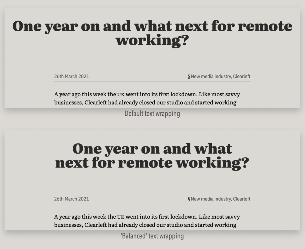
Another experimental feature in the latest Chrome is the text-wrap:balance property, which allows us to balance the length of lines in a given text. Importantly, the text cannot exceed 4 lines, so the new property is only suitable for styling headlines and short descriptions under images or code snippets.
h2, h2, h3, h4, h5, h6, caption, figcaption {
    text-wrap: balance;
}
Balance your headers and captions with new balance property
The Headless Chrome we all deserve
Did you know that the Headless Chrome you use for E2E testing actually has little in common with the Chrome that is installed on your computers? It turns out that Headless Chrome is a separate browser being developed. Looking at the level of feature parity it’s really hard to believe. Considering the effort that must have gone into maintaining the second browser, the decision to merge the two versions of Chrome is not surprising.
A flag, --headless=new, has made it the latest Chrome, which launches the new unified browser in headless mode. Chrome will continue to develop the old alternative version of the browser (for backward compatibility reasons, it’s the one that will launch with the --headless flag), but the team hopes to somehow extinguish it over time.
Chrome’s Headless mode gets an upgrade

2. Performance reports on Server Side Rendering frameworks
Reports and summaries are what we like most at Vived. This past week saw the release of two very interesting summaries comparing server-side rendering frameworks.
The first was prepared by the Astro team and is based on real user data collected by Chrome. TLDR; In all categories analyzed, Astro, SvelteKit and Remix win, leaving Next.js, Nuxt or WordPress far behind. However, there are a few things to remember when interpreting the results. The frameworks that lag behind are already years old and quite a few of analyzed pages are long-unmaintained projects. Secondly, the frameworks coming to the fore are a small percentage of websites on the Internet and are mainly used by technology enthusiasts.
2023 Web Framework Performance Report
The second report was prepared by the developer of Eleventy and focuses on the tests conducted locally. Report analyses time taken to build the application, the size of the package sent to the client or the number of external dependencies. TLDR; In most of the analyzed categories, Eleventy, Astro and SvelteKit again come to the forefront. This time, the other frameworks are not far behind, and depending on the category, Next.js or the little-known Enhance scroll in the top three.
The javascript site generator review, 2023
3. what’s the deal with React Server Components?
There’s a lot of talk about React Server Components, but it’s actually hard to find a concise and good explanation of the concept. To the rescue, as usual, comes Josh W Comeau, whom you may associate with great publications on React. Admittedly, this time we’re not dealing with a blogpost, but with a Twitter thread about combining Styled Components with React Server Components, but it’s the best presentation of the topic I’ve seen so far.

4. Civet
To conclude today’s review, a little tidbit for anyone bored with the pace of TypeScript development. Civiet is a new language compiled into JavaScript and TypeScript, which offers an implementation of many features that have been stuck in TC39 Pipeline for a long time (e.g. Pattern Matching, Pipe Operator). Does TypeScript have anything to fear? Rather not. Will Civet take the hearts of developers by storm? Rather not. Does Civet look interesting? Maybe!
// Pattern Matching
switch x
  0
    console.log("zero")
  /^\s+$/
    console.log("whitespace")
  [{type: "text", content}, ...rest]
    console.log("leading text", content)
// Single-Argument Function Shorthand
x.map .name
x.map &.profile?.name[0...3]
x.map &.callback a, b
x.map &+1
x.map -&// Pipelines
data
|> Object.keys
|> console.log


